了解 SAP Analytics Cloud 中的 R 代码
学习目标
使用 R 代码。
R 可视化对象和 R 代码的示例
通过选择"插入"和"R 可视化对象",可以使用 R 中的脚本创建各种统计图。
在本课中,你将了解在 SAP Analytics Cloud 中创建的 R 可视化对象的九个示例以及脚本编辑器中的相关 R 代码。
可以复制代码并在 SAP 实践练习系统中使用,以尝试本单元中使用的各种 R 可视化对象。
折线图
在此示例中,您可以看到为按地区显示一段时间内的销售收入而创建的折线图。
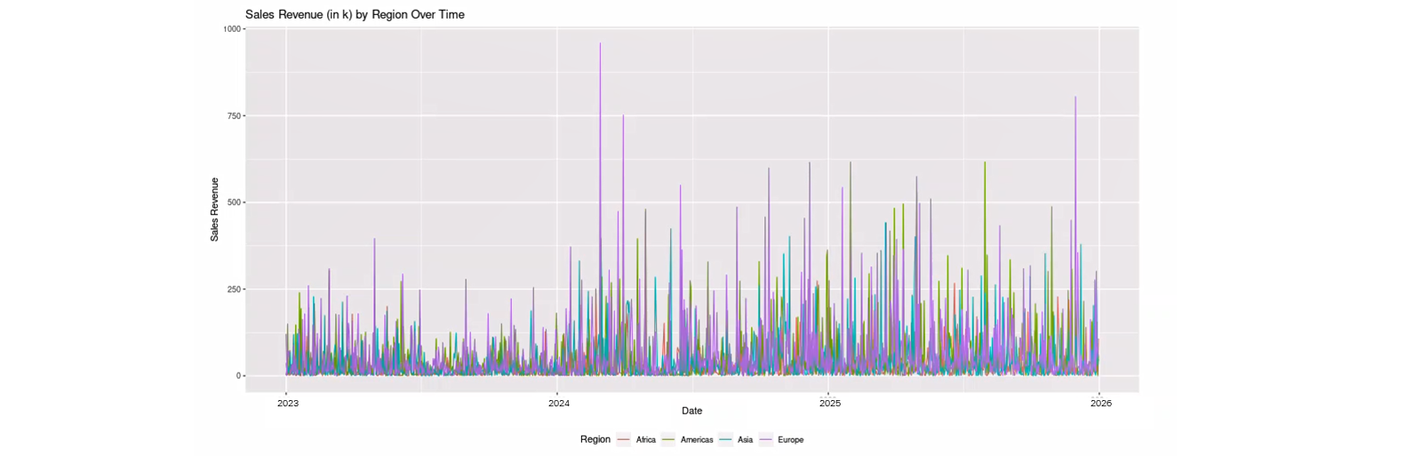
上例是在 R 可视化对象脚本编辑器中使用以下 R 代码创建的:
library(ggplot2)

BestRunCorpRetail$`Sales Revenue` <- BestRunCorpRetail$`Sales Revenue` / 1000

# Line Graph for Sales Over Time
ggplot(BestRunCorpRetail, aes(x = Date, y = `Sales Revenue` , group=Region, color=Region )) +
geom_line() +
labs(title = "Sales Revenue (in k) by Region Over Time",
x = "Date",
y = "Sales Revenue") + theme(legend.position="bottom")
theme_minimal()
堆叠水平条形图
在此示例中,您可以看到已创建堆叠水平条形图,以按地区和线显示销售数量。
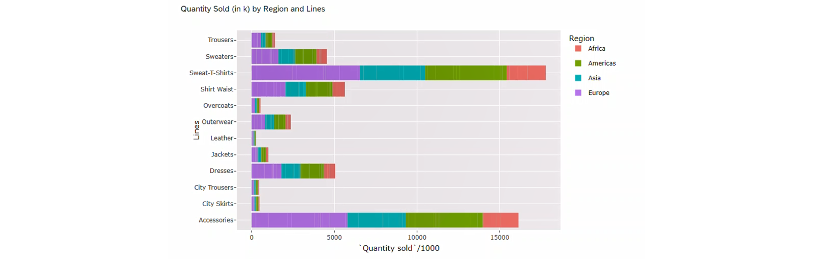
某些 R 可视化对象可以创建为交互式统计图。此示例是用户可以与之交互以隔离并关注特定数据的统计图,如下图所示。
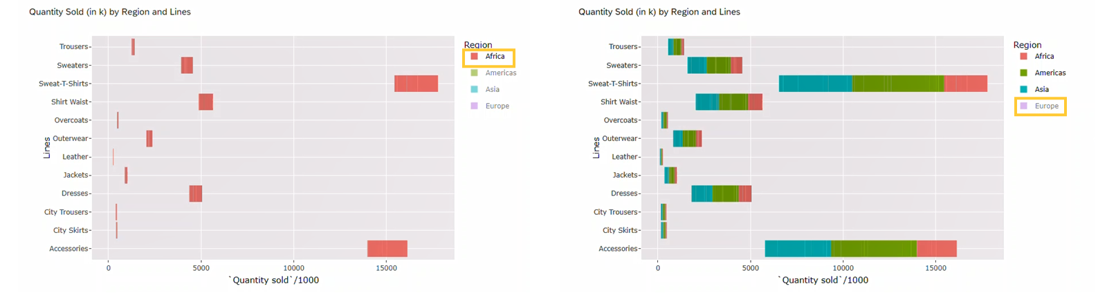
上例是在 R 可视化对象脚本编辑器中使用以下 R 代码创建的:
library(ggplot2)
library(plotly)
# Bar Chart for Sales by Product Category
p1 <- ggplot(BestRunCorpRetail, aes(x = Lines, y = `Quantity sold`/1000 , fill = Region )) +
geom_bar(stat = "identity") + coord_flip()

ggplotly(p1, tooltip = c("x", "y", "fill"))
散点气泡图
在此示例中,可以看到已经创建了一个交互式散点气泡图,用于按销售数量显示每个销售经理的销售收入比较。
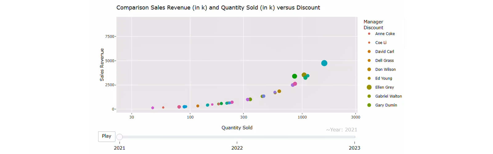
这是另一个交互式图表的示例。用户可以播放交互,并将鼠标悬停在交互的元素上以查看附加信息,如下图所示。
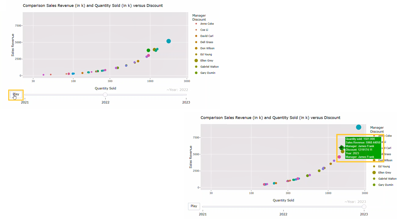
上例是在 R 可视化对象脚本编辑器中使用以下 R 代码创建的:
# import packages ggplot2 and plotly
library(ggplot2)
library(plotly, warn.conflicts = FALSE)

# create a ggplot frame through function ggplot() and add data points, labels and scale settings
BestRunCorpRetail$`Sales Revenue` <- BestRunCorpRetail$`Sales Revenue` / 1000
BestRunCorpRetail$`Quantity sold` <- BestRunCorpRetail$`Quantity sold` / 1000
gg <- ggplot(BestRunCorpRetail, aes(`Quantity sold`, `Sales Revenue`, color = Manager)) +
geom_point(aes(size = Discount , frame = Year, ids = Manager)) +
labs(title = "Comparison Sales Revenue (in k) and Quantity Sold (in k) versus Discount" ,
y = "Sales Revenue",
x = "Quantity Sold") +
scale_x_log10()

# convert the ggplot frame to a plotly frame through function ggplotly()
ggplotly(gg)
密度图
在此示例中,可以看到为显示每个区域中产品线的密度而创建的密度图。
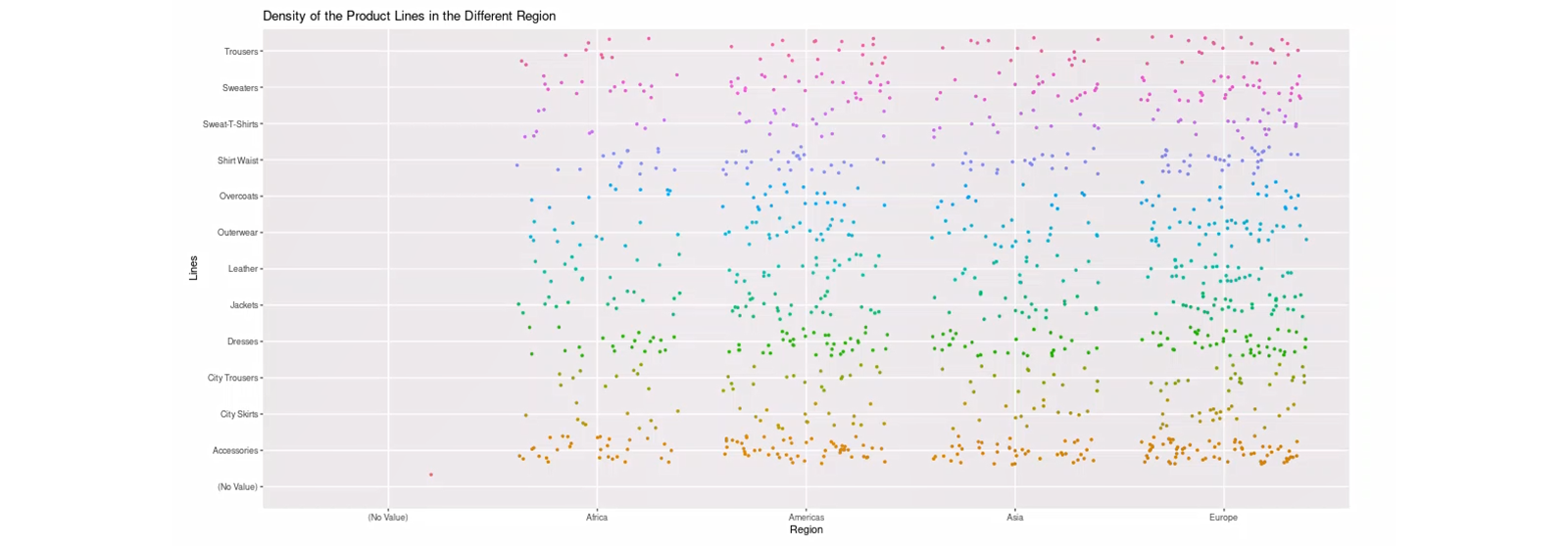
上例是在 R 可视化对象脚本编辑器中使用以下 R 代码创建的:
# import packages ggplot2 and plotly
library(ggplot2)
library(plotly, warn.conflicts = FALSE)
ggplot(BestRunCorpRetail, aes( Region , Lines )) +
labs(title = "Density of the Product Lines in the Different Region" ) +
geom_jitter(aes(color = Lines ), size = 1) + theme(legend.position="none")
文字云
在此示例中,您可以看到已创建了"云"一词,用于显示城市和相关毛利率之间的关系。

上例是在 R 可视化对象脚本编辑器中使用以下 R 代码创建的:
# load package
library(wordcloud)
# get words
words <- BestRunCorpRetail$`City`
# get frequency
frequency <- BestRunCorpRetail$`Gross Margin`
# generate word cloud
wordcloud(words, frequency, scale = c(4, 1.5), rot.per=0.2, colors=brewer.pal(8, "Blues"))
桑基网图
在此示例中,您可以看到为按地区、国家/地区和城市显示投诉而创建的桑基网络图。
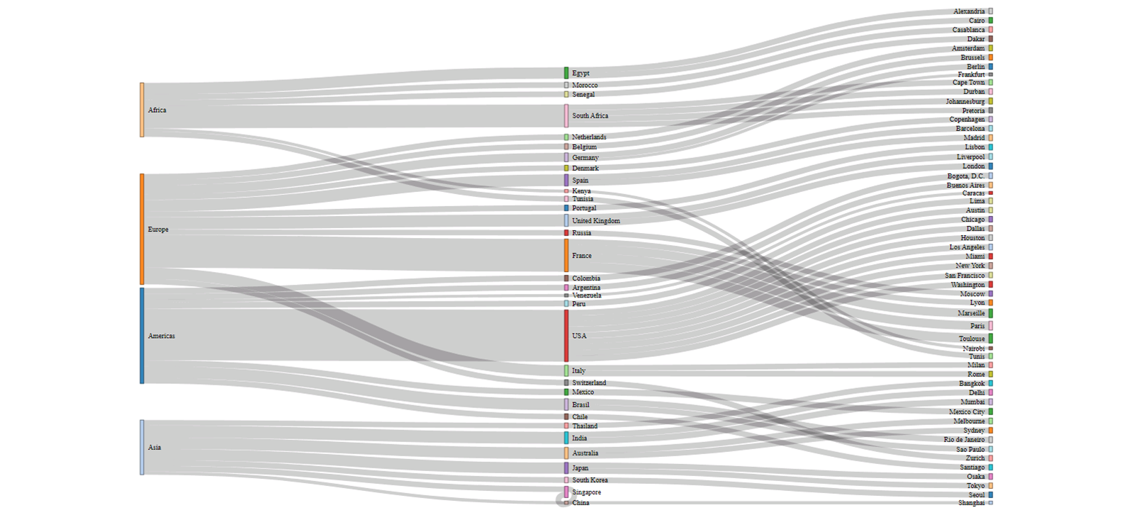
这是一个统计图示例,用户可以将鼠标悬停在元素上以查看相关信息,如下图所示。
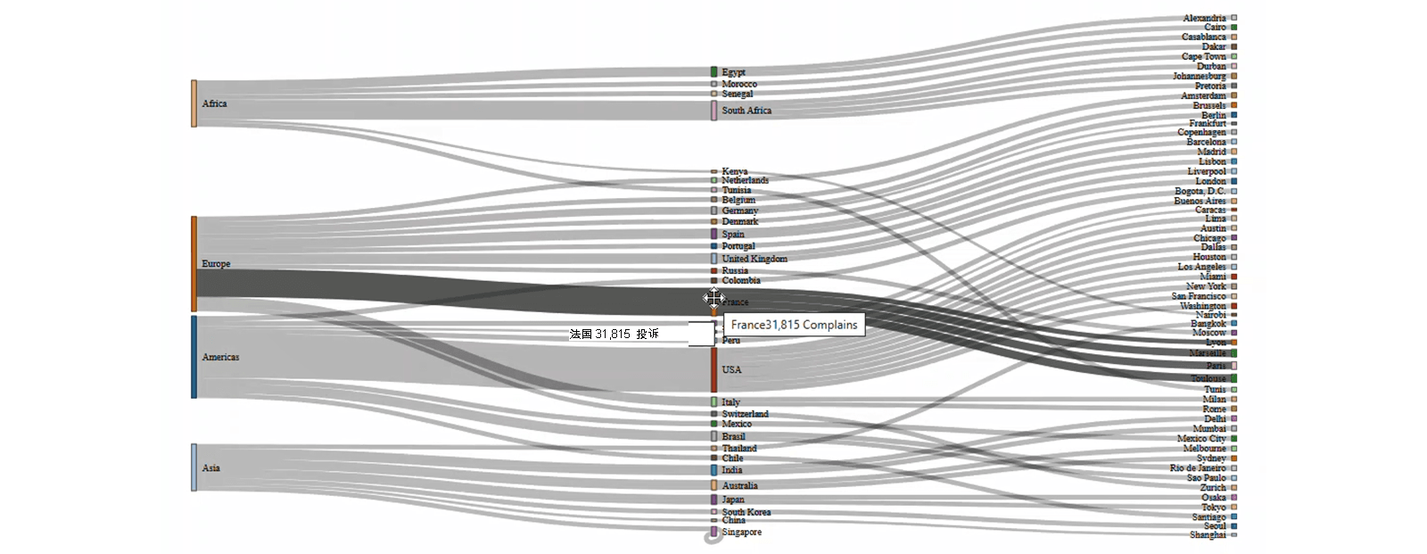
上例是在 R 可视化对象脚本编辑器中使用以下 R 代码创建的:
# import package dplyr and networkD3
suppressPackageStartupMessages(library(dplyr))
library(networkD3)

# de-factorize three level columns in SankeyData2 to strings
BestRunCorpRetail$Region <- as.character(BestRunCorpRetail$Region)
BestRunCorpRetail$Country <- as.character(BestRunCorpRetail$Country)
BestRunCorpRetail$City <- as.character(BestRunCorpRetail$City)

# create the first- and second-level decomposition dataset as list of (source, target, amount)
level_1 <- aggregate(BestRunCorpRetail[,4], by=list(BestRunCorpRetail$Region, BestRunCorpRetail$Country), FUN=sum)
level_2 <- aggregate(BestRunCorpRetail[,4], by=list(BestRunCorpRetail$Country, BestRunCorpRetail$City), FUN=sum)

# rename the headers in the two level data frames
names(level_1) <- c("Source","Target","Complains")
names(level_2) <- c("Source","Target","Complains")

# stack the two level data frames together
sankeyData <- suppressWarnings(bind_rows(level_1, level_2))

# create a list of nodes in all levels and index them from 0
sankeyNodes <- data.frame(Name = unique(c(sankeyData$Source, sankeyData$Target)))
sankeyNodes$index <- 0:(nrow(sankeyNodes)-1)

# create a sankeyLinks data frame by masking node names in sankeyData with their indexes in sankeyNodes
sankeyLinks <- merge(sankeyData, sankeyNodes, by.x="Source", by.y="Name")
sankeyLinks <- merge(sankeyLinks, sankeyNodes, by.x="Target", by.y="Name")

# select the masked columns and rename the headers
sankeyLinks <- sankeyLinks[, c(4,5,3)]
names(sankeyLinks) <- c("Source","Target","Complains")

# call the sankeyNetwork() function to generate the sankey diagram
sankeyNetwork(Links = sankeyLinks, Nodes = sankeyNodes,
Source = "Source", Target = "Target",
Value = "Complains", NodeID = "Name",
fontSize = 10, nodeWidth = 5, nodePadding = 5 , unit="Complains")
极线条形图
在此示例中,你可以看到为按地区显示毛利润和销售收入而创建的极线图。
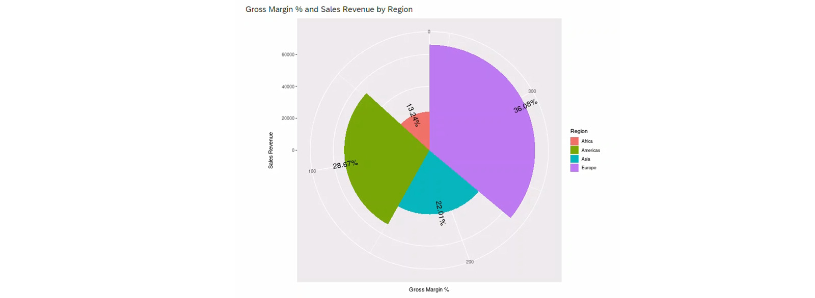
上例是在 R 可视化对象脚本编辑器中使用以下 R 代码创建的:
library(ggplot2)
library(reshape2)

SalesRevenue <- as.numeric(BestRunCorpRetail$`Sales Revenue`) / 1000
total_GrossMargin <- sum(BestRunCorpRetail$`Gross Margin`)
Region <- as.character(BestRunCorpRetail$Region)
percentage <- BestRunCorpRetail$`Gross Margin` * 100/ total_GrossMargin
percentage_char <- as.character(formatC(percentage, digits = 2, format = "f"))
width <- percentage * 3.6
GrossMargin <- c(width[1]/2)
label <- paste(percentage_char, seq = "%", sep = "")
for (i in 2:length(width)) {
GrossMargin <- c(GrossMargin, sum(width[1:i-1]) + width[i]/2)
}
angle <- GrossMargin
for (i in 1:length(angle)) {
if (angle[i] >= 180) {
angle[i] <- angle[i] - 180
}
}
rose <- data.frame(SalesRevenue, Region, GrossMargin)
p <- ggplot(rose, aes(x=GrossMargin, y=SalesRevenue, fill=Region))+
geom_bar(width=width, stat="identity")+
geom_text(aes(x=GrossMargin, y=SalesRevenue+40, label=label, angle=angle-90), size=5)+
labs(x="Gross Margin %", y="Sales Revenue
")
p + coord_polar(theta="x", start=0, direction=-1)
滞后图
在此示例中,您可以看到已创建滞后图,以显示每个季度报告的问题数量。
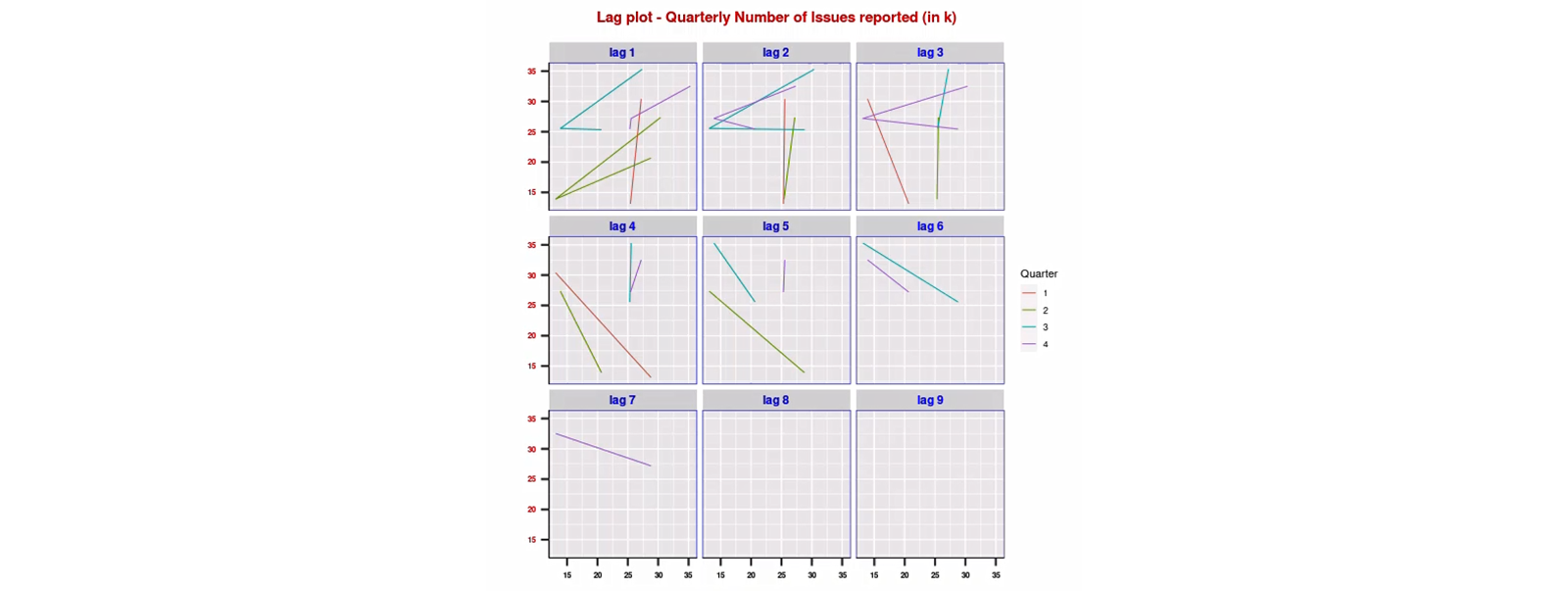
上例是在 R 可视化对象脚本编辑器中使用以下 R 代码创建的:
library(lubridate)
library(dplyr)
library(ggplot2)
library(forecast)
## Prepare data
BestRunCorpRetail$`Number of Issues reported` <- BestRunCorpRetail$`Number of Issues reported` / 1000
df <- BestRunCorpRetail %>%
mutate(Year = as.integer(as.character(Year))) %>%
mutate(quarter_num = as.numeric(substr(Quarter, 2, 2))) %>%
mutate(first_month_of_quarter = (quarter_num * 3) -2) %>%
mutate(first_day_of_quarter = make_date(
Year,
first_month_of_quarter,
1)) %>%
select(first_day_of_quarter, `Number of Issues reported`) %>%
arrange(first_day_of_quarter)
## Convert to ts object
first_period = min(df$first_day_of_quarter)
last_period = max(df$first_day_of_quarter)
tso <- ts(df$`Number of Issues reported`,
start = c(year(first_period), quarter(first_period)),
end = c(year(last_period), quarter(last_period)),
frequency = 4)
## Plot
ts <- window(tso,start=2021)
p <- gglagplot(ts, do.lines = TRUE, seasonal=TRUE, colour=TRUE, diag=FALSE , lags = 9) +
labs(title = "Lag plot - Quarterly Number of Issues reported (in k)")
## Layout
p +
theme(
plot.title = element_text(color="red", size=15, face="bold", hjust=0.5 ,margin = margin(t = 0, r = 0, b = 16, l = 0)) ,
panel.border = element_rect(colour = "blue", fill=NA) ,
axis.ticks = element_line( size = 1, linetype = 'solid') ,
axis.ticks.length = unit(8, "pt"),
axis.text.x = element_text(color="black", size = 8, face = "bold" , margin = margin(t = 6, r = 0, b = 0, l = 0)) ,
axis.title.x = element_text(color="blue", size = 12, face = "bold", margin = margin(t = 10, r = 0, b = 0, l = 0)) ,
axis.text.y = element_text(color="red", size = 8, face = "bold" , margin = margin(t = 0, r = 6, b = 0, l = 0)) ,
axis.title.y = element_text(color="yellow", size =12, face = "bold", margin = margin(t = 0, r = 10, b = 0, l = 0)) ,
axis.line = element_line(colour = "black") ,
strip.text = element_text(color="blue", size = 12, face = "bold")
)
帕累托图
在此示例中,可以看到已创建用于按地区显示销售收入的帕累托图。
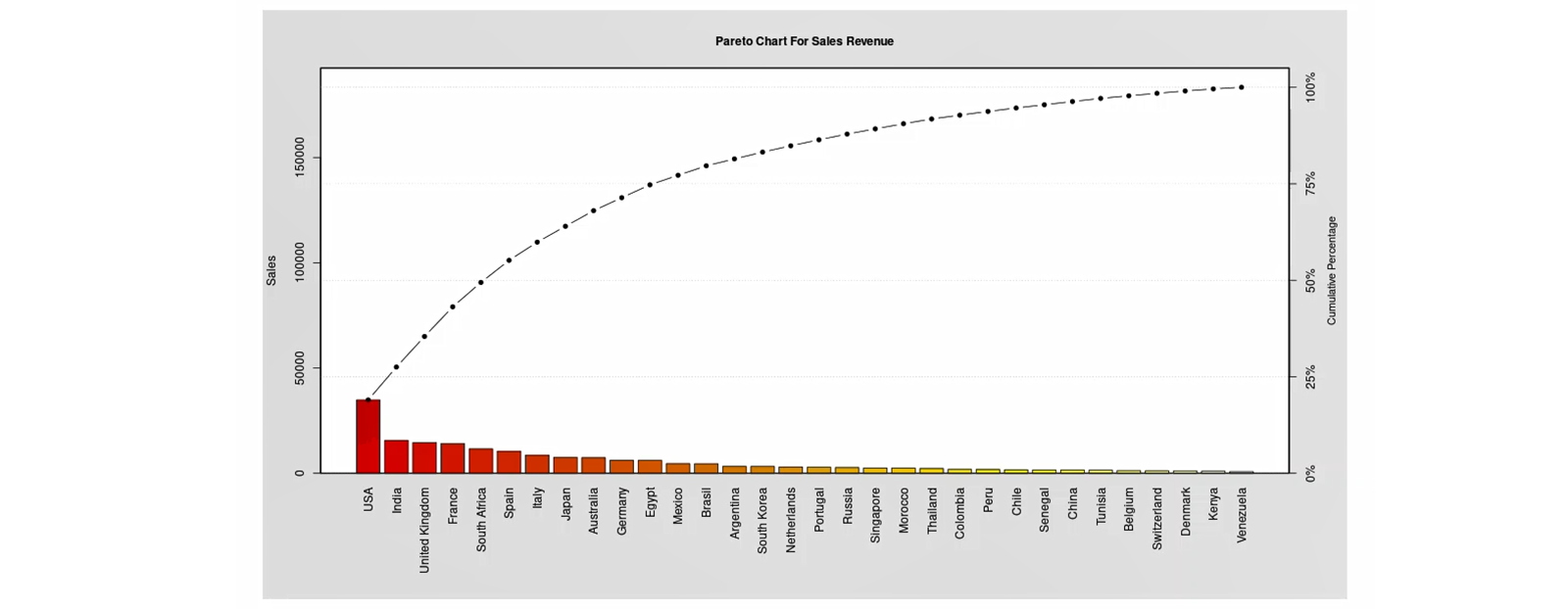
上例是在 R 可视化对象脚本编辑器中使用以下 R 代码创建的:
library(ggplot2)
library(qcc)

Sales = BestRunCorpRetail$`Sales Revenue` / 1000
names(Sales) = BestRunCorpRetail$`Country`

pareto.chart(Sales, ylab = "Sales",main='Pareto Chart For Sales Revenue',col=heat.colors(length(Sales)))