在故事中创建高级 R 可视化对象
学习目标
为峰值、非峰值、夜间和周末创建着色的 R 可视化对象折线图。
高级 R 可视化对象
线形图
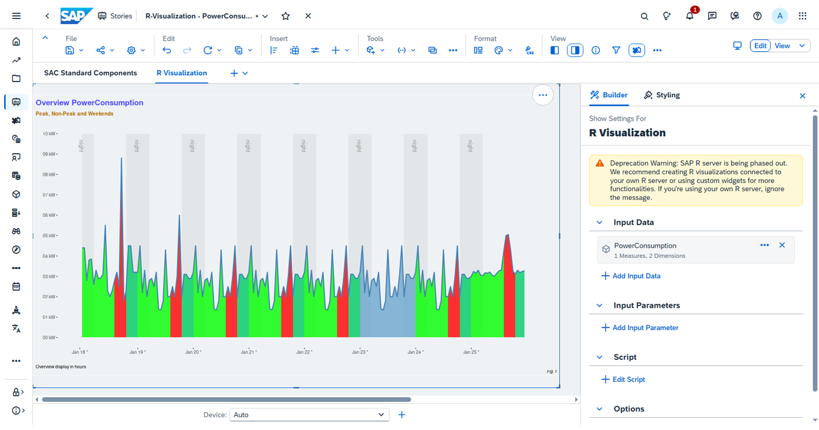
在本课中,你将应用到目前为止在本课程中学到的知识,并在 SAP Analytics Cloud 故事中使用 R 代码创建高级 R 可视化对象,以使用颜色识别的峰值、非高峰和周末使用量的功耗。
创建高级 R 可视化对象
业务场景
您需要创建一个显示公司功耗的图表。他们希望图表以不同颜色显示峰值、高峰期和周末。
为此,用户决定添加 R 可视化对象以创建此自定义统计图。
任务 1: 使用 R 可视化对象创建时间图
**任务流:**在本练习中,您将:
向故事中添加 R 可视化对象微件
配置图表的输入数据
添加初始脚本
练习:开始练习(SAP 官方交互式练习)
任务 2: 设置 R 可视化对象的 X 轴和 Y 轴
**任务流:**在本练习中,您将:
添加脚本以调整时间
配置所需时间段的图表
为过夜时间段添加阴影
练习:开始练习(SAP 官方交互式练习)
任务 3: 使用自定义时间段配置图表
**任务流:**在本练习中,您将:
将隔夜时间段的阴影添加到图表
更改故事背景的统计图背景颜色
练习:开始练习(SAP 官方交互式练习)
任务 4: 自定义 R 可视化对象
**任务流:**在本练习中,您将:
向统计图中添加自定义标题、副标题、标题和标签
向统计图中添加自定义主题
从统计图中移除标准标题和副标题
练习:开始练习(SAP 官方交互式练习)
本练习中使用的完整 R 代码
R 可视化对象脚本编辑器的"编辑器"窗口中的最终 R 代码如下所示:
library(ggplot2)
# SAC reformat dates - SAC sends dates as strings looking like: Jan 1, 2019 01:01:01 - we need as real R dates.
PowerConsumption$Time <- as.POSIXct(PowerConsumption$Time, tz="", format="%b %d, %Y %I:%M:%S")
# The Id column (from the SAC model) is delivered as a "factor" - we need it as a numeric.
# Note: use as.character first because factors have an internal identifier that as.numeric returns instead of the actual value.
PowerConsumption$Id <- as.numeric(as.character(PowerConsumption$Id))
# Ensure the sort - SAC does not necessarily provide the data sorted.
PowerConsumption <- PowerConsumption[order(PowerConsumption$Id),]
# Make an easier name for the dataset - this allows me to test everything below regardless of data source.
dataSet <- PowerConsumption
# Build the plot area - nothing is plotted in this call - just setting up the canvas where we will add layers.
p <- ggplot(data=dataSet, aes(x=Id, y=Usage))
# Add the x and y axis layouts.
# For the y-axis, we use the actual data values, but recode the display to use more meaningful labels.
p <- p + scale_y_continuous(name="",
limits=c(0, 10),
breaks=c(0, 1, 2, 3, 4, 5, 6, 7, 8, 9, 10),
labels=c("0" = "00 kW",
"1" = "01 kW",
"2" = "02 kW",
"3" = "03 kW",
"4" = "04 kW",
"5" = "05 kW",
"6" = "06 kW",
"7" = "07 kW",
"8" = "08 kW",
"9" = "09 kW",
"10" = "10 kW"
)
)
# For the x-axis, we use the Id of each 24 hour period as an index to recode to the date name.
# In a production graph, this would be done programatically using the $Time column.
p <- p + scale_x_continuous(name = "",
limits=c(0, 192),
breaks=c(0, 25, 49, 73, 97, 121, 145, 169),
labels=c("0"   = "Jan 18 *",
"25"  = "Jan 19 *",
"49"  = "Jan 20 *",
"73"  = "Jan 21 *",
"97"  = "Jan 22 *",
"121" = "Jan 23 *",
"145" = "Jan 24 *",
"169" = "Jan 25 *")
)

# WE ASSUME all 24 hours are present on each day - add shading rectangles for the overnight areas.

for (day in c(1, 2, 3, 4, 5, 6, 7, 8)) {
# Again, we are using the Id column as an index to the x-axis and it should be done programmatically based on the actual dates.
morningBegin = (day - 1) * 24 + 1
morningEnd = morningBegin + 5
nightBegin = morningBegin + 19
nightEnd = nightBegin + 5

# Create the "night" label.
nightLabel <- annotate(geom="text",
x=morningBegin - .2,
y = 9.7,
label="night",
hjust=0,
size=4,
color="gray58",
angle=-90)

# Add the morning and evening rectangles - put the night label last to put it on top of the rectangles.
p <- p +
annotate("rect", xmin=morningBegin, xmax=morningEnd, ymin=0, ymax=10, alpha=.08) +
annotate("rect", xmin=nightBegin, xmax=nightEnd, ymin=0, ymax=10, alpha=.08) +
nightLabel
}

for (day in c(1, 2, 3, 4, 5, 6, 7, 8)) {
offBegin = (day - 1) * 24 + 1
lastRead = offBegin + 24
dayOfWeek = format(dataSet$Time[offBegin], "%w")

if (dayOfWeek == "0" | dayOfWeek == "6") {
# Do not highlight peak on the weekends - entire day has the same shading.

p <- p + geom_ribbon(data=subset(dataSet, Id>=offBegin & Id<=lastRead),
aes(ymax=Usage),
ymin=0,
fill="skyblue3",
colour=NA,
alpha=.8)
} else {
# Divide the day into the three pieces and add them to the plot.

offEnd  = offBegin + 14
peakEnd = offEnd + 5

p <- p + geom_ribbon(data=subset(dataSet, Id>=offBegin & Id<=offEnd),  # Early non-peak
aes(ymax=Usage),
ymin=0,
fill="green",
colour=NA,
alpha=.8) +
geom_ribbon(data=subset(dataSet, Id>=offEnd & Id<=peakEnd),   # Peak
aes(ymax=Usage),
ymin=0,
fill="red",
colour=NA,
alpha=.8) +
geom_ribbon(data=subset(dataSet, Id>=peakEnd & Id<=lastRead), # Late non-peak
aes(ymax=Usage),
ymin=0,
fill="springgreen3",
colour=NA,
alpha=.8)
}
}

p + geom_line(color="steelblue", size=1)+
theme(plot.background = element_rect(fill = "#eff2f4"),
panel.background = element_rect(fill = '#eff2f4', color = '#eff2f4', size = 3),
panel.grid.major = element_line(color = '#eff2f4'),
panel.grid.minor = element_line(color = '#eff2f4', size = 1)) +
labs(title 	= "Overview PowerConsumption",
subtitle 	= "Peak, Non-Peak and Weekends",
caption 	= "Overview display in hours",
tag 	= "Fig. 1")+
theme(plot.title = element_text(family = "Arial",	  # Font family
face = "bold",		  # Font face
color = "steelblue",		  # Font color
size = 15,			  # Font size
hjust = 0,			  # Horizontal adjustment
vjust = 5,			  # Vertical adjustment
angle = -0,			  # Font angle
lineheight = 0,		  # Line spacing
margin = margin(20, 0, 0, 0)),  # Margins (t, r, b, l)
plot.subtitle = element_text(family = "Arial",		  # Font family
face = "bold",		  # Font face
color = "brown",		  # Font color
size = 10,			  # Font size
hjust = 0,			  # Horizontal adjustment
vjust = 5),			  # Vertical adjustment
plot.caption = element_text(hjust = 0),		          # Caption customization
plot.tag = element_text(face = "italic", size = 8),	   # Tag customization
plot.title.position = "plot",			# Title and subtitle position ("plot" or "panel")
plot.caption.position = "plot" ,			  # Caption position ("plot" or "panel")
plot.tag.position = "bottomright")		          # Tag position